The COVID-19 pandemic shutdown schools around the world, leaving 1.2 billion children out of their classroom and newly introduced to remote learning, challenging their learning habits.
The Problem 🚨
PROJECT OVERVIEW
Class+ is an IOS mobile application that allows university students to prepare for lectures, stay engaged during class, practise concepts after class, and to find a peer they can review concepts with.
The Solution 🌱
Role
UX Research Ideating Prototyping Testing Iterating
Project Type
Mobile Application Course Project
Team
Jessica Porciello Anica Chen
Tools Used
Procreate PowerPoint Figma Canva
Duration
2 months
The Design Challenge
“How might we encourage attendance, participation, and group discussion in remote learning?”
We followed the design thinking process to ensure our developed design solution accurately addressed our user’s pain points, motivations and behaviours.
The Design Process
Examining Further
USER RESEARCH 💻
We made the decision to focus on university students attending Wilfrid Laurier University as our targeted users. Therefore, to gain a deeper understanding of their behaviours towards remote learning we conducted contextual inquiries with six willing participants.
We completed the inquiry while observing each of our participant’s actions while they interacted with their online classes/lectures over Zoom. Here are some examples of the questions we asked:
Conventional Questions
Contextual Questions
Through our research, we discovered a common pattern of our users feeling disengaged during lectures and in turn not receiving the grades they ultimately want. We sorted our main findings and user frustrations into three main categories; before, during, and after class, as shown below:
FINDINGS 🔎
Users Feel Disengaged & Unprepared
Interview Insights🤳🏼
BEFORE, DURING, or AFTER Class
Users feel more relaxed when they have a friend in their classes. This way they can ask for help or refer to their friend to catch up with anything they missed.
BEFORE Class
Users found that when professors posted topics & activities to be covered in class beforehand, they felt better prepared.
AFTER Class
Since lectures are mainly recorded and posted, users often make the decision to not attend the live sessions. However, they admit to falling behind with watching the recordings too.
DURING Class
Users feel more motivated to follow through lessons when class first begins but find themselves distracted after a while; not finding certain parts of information as important and instead going on their phones.
EMPATHY MAP 🗺️
Synthesizing User Need Insights
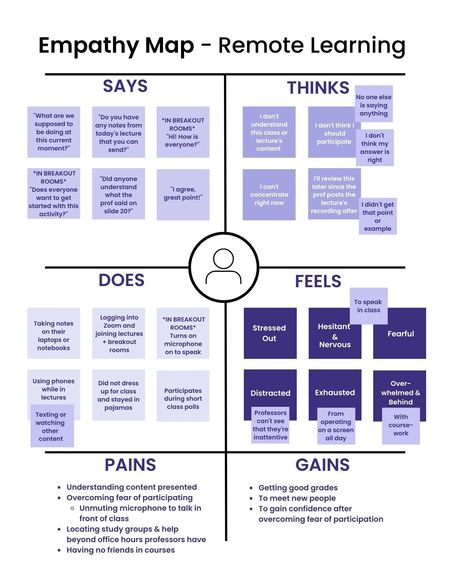
Through the research and data we were able to gather while observing our user during the contextual inquiry, we were able to synthesize a few insights and create a relevant empathy map that expresses what students are thinking, saying, feeling, doing, and their pains and gains.
USER PERSONA💁♀️
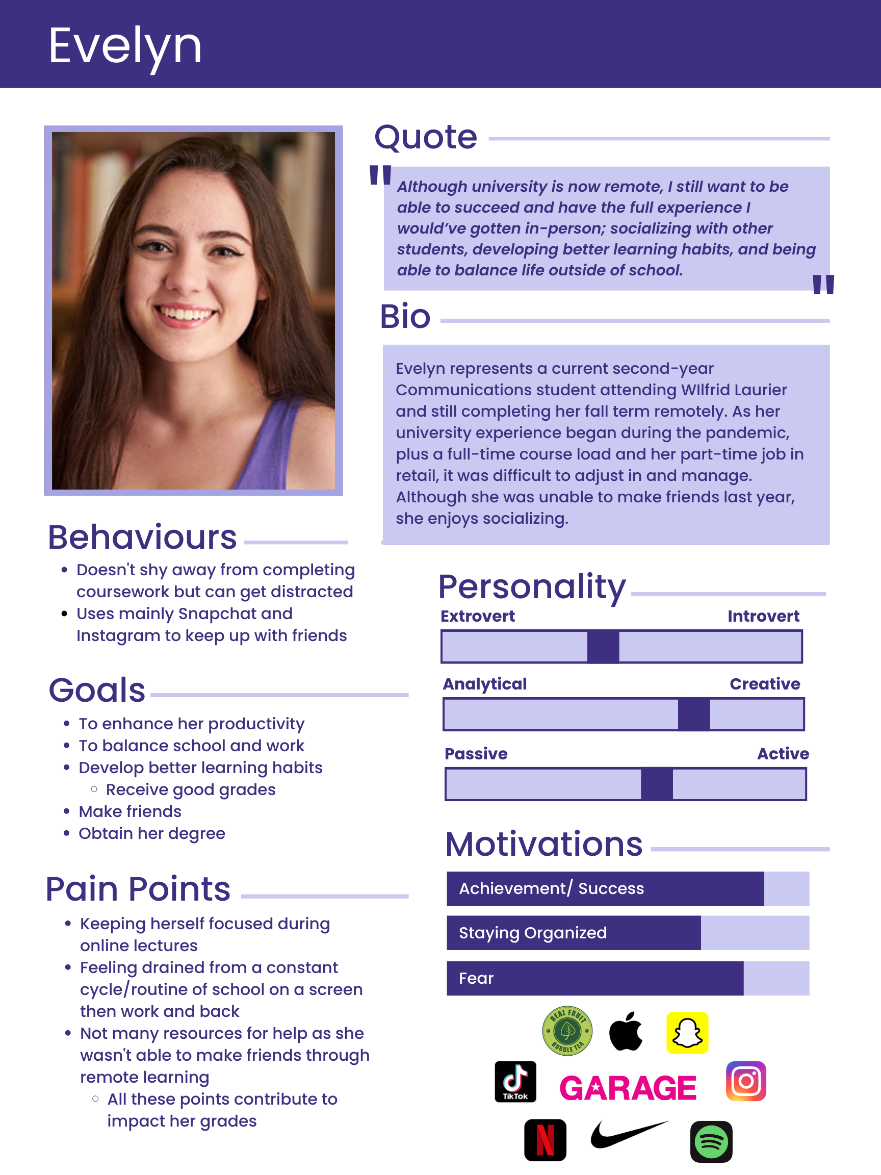
Meet Our Core User, Evelyn!
Our team was able to create a relevant persona representing a fictional depiction of our core user that exhibited similar motivations, behaviours, and overall responses that we gathered from our contextual inquiries and user interviews.
JOURNEY MAP🚊
Depicting Evelyn’s Journey
DEFINE🖊️
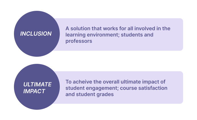
Our research helped us to identify the following user needs that includes two components:
User Need Statements
REVISED Design Challenge
“How can we develop an inclusive solution to increase student engagement and participation in remote classes in order to improve course satisfaction and student grades?”
Ideation Time!
IDEATE💡
To help us ideate for our possible design solutions, we used the technique SCAMPER. We chose and shortlisted over 40 ideas into some of the following:
Provide quizzes to review concepts
Inform professors of how students are doing
Connect with peers
This helped us finalize our idea: a mobile app for students. As all our users told us they would have their phones nearby during online lectures, we thought we could use it as a way students can use their phones as an asset rather than a distraction.
Class+ Application Features:
3) DURING Lectures
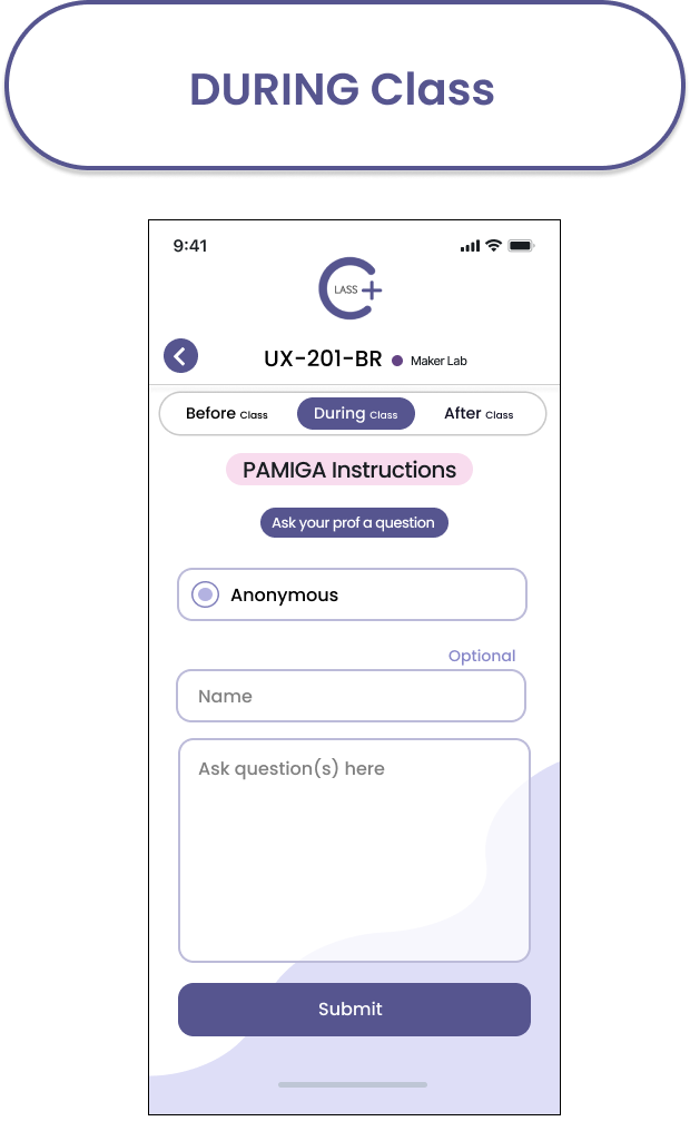
Students can anonymously let the professor know about their comfortability with class content; they can rate how they feel with a sad, medium, or happy face, on a specific slide’s content in real time
4) AFTER Lectures
Students can rate their comfortability with concepts by giving a final rating about the day’s content to professors. They can also review the concepts they learned from the lecture with a quiz.
5) HELP
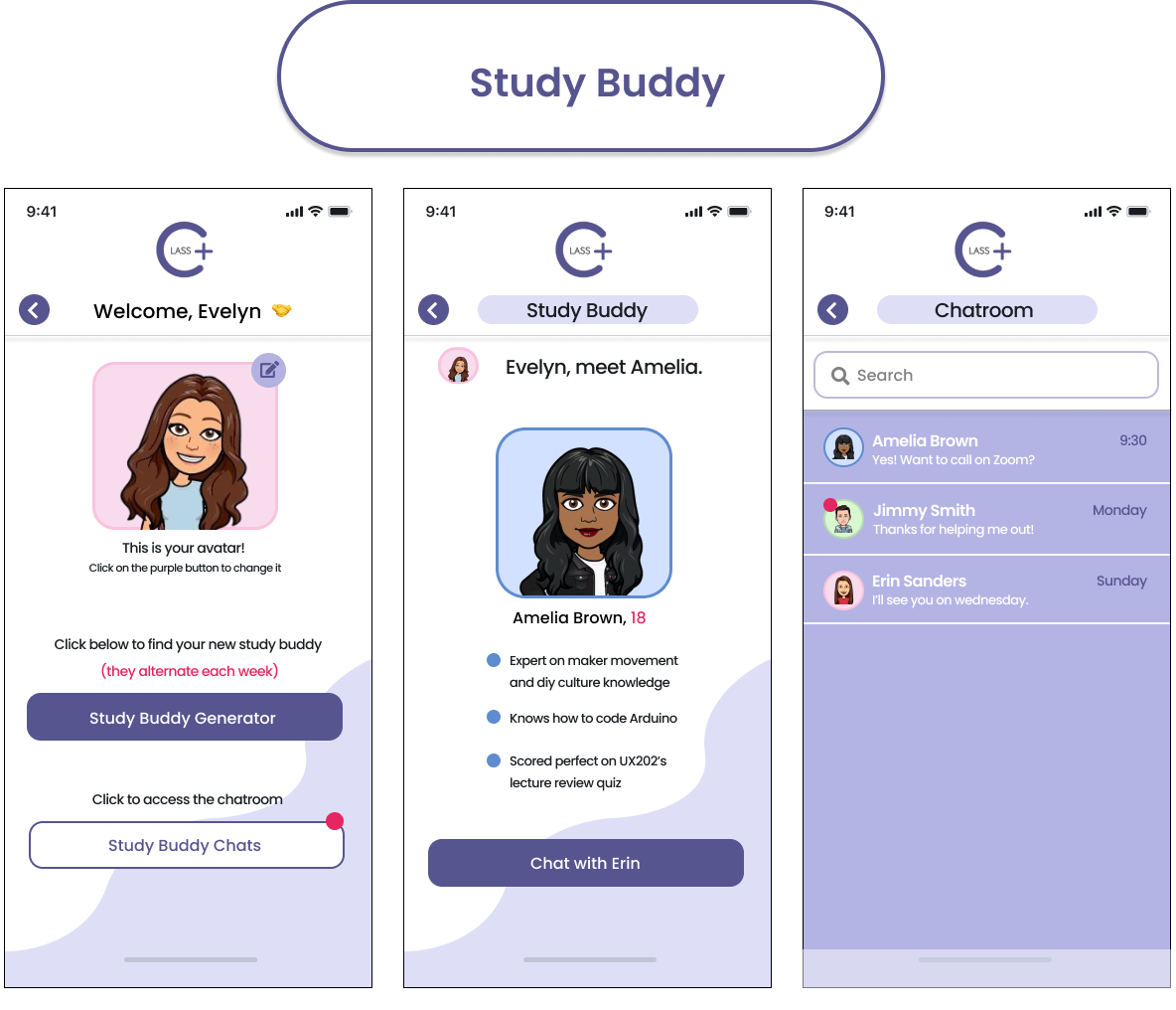
Based on how students rate topics, they are matched with a study buddy and can chat with one another.
2) BEFORE Lectures
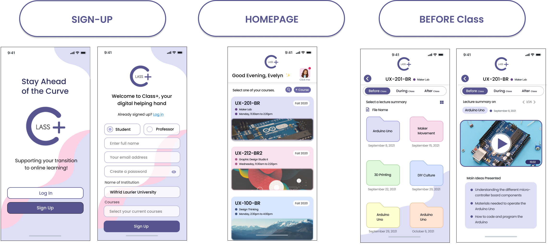
To help students prepare for their lectures beforehand. It includes quick lecture summary videos and a brief list of the main concepts to be learnt in class.
1) HOMEPAGE
Where students can access the feature they’re looking for (before, during, or after class and study buddy).
LOW-FIDELITY PROTOTYPE ✍️
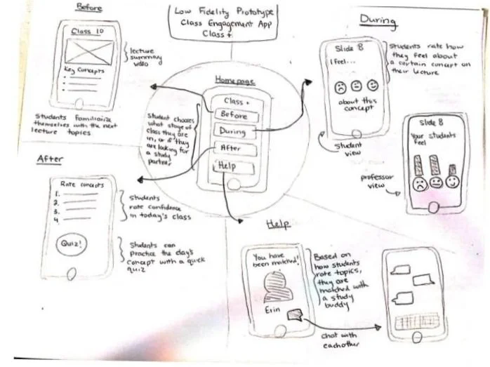
We sketched out our solution to further explore its layout and overall hierarchy.
Sketching Our Solution
Identifying Areas to Further Improve
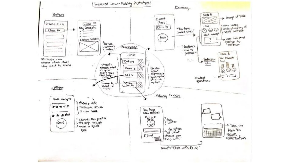
REFINED LOW-FIDELITY PROTOTYPE ✍️
Using the wizard of oz experiment, we tested the before, during, after and study buddy interfaces of the app to see if each page is digestible, understandable, and able to do what the users want it to do. The following is what we changed:
1) BEFORE Class
Organize the lecture summaries by the course and date
2) AFTER Class
A page where students can choose which course’s concepts they want to review
Instead of having students rate concepts in order, have them rate each concept using stars (1-5 stars)
3) DURING Class
Include the slide people are rating on the app
Once a student rates how they feel about concepts on a slide, display a notification saying ‘Rating Submitted’
4) STUDY BUDDY
Change the ‘Help’ section to the name ‘Study Buddy’
Remind students that their study buddy changes after a week
Allow users to make an avatar to make more comfortable
Validating the Solution
MEDIUM-FIDELITY PROTOTYPE 🖥️
Using our findings from the low-fidelity prototype, we developed our medium-fidelity prototype. We decided not to design the ‘professor’s view’ and instead focus on testing how our primary users, students, navigate through our design’s clickable interface components. Here is what we designed on Figma:
Testing with UX Guerrilla & Think-Aloud
USABLITY TEST PLAN 🗓️
We used the think-aloud protocol and UX guerrilla testing technique to help us better understand their interactions with our design solution. It ensured we obtained valuable insights through their experiences with our interface design so that we could further create iterations. We found:
1) “Is there a way I can view future lecture summaries or past ones?”
Users felt it would be helpful to prepare for future lectures as well. They also wanted the ability to view past lecture summaries for reference.
Key Insights🤳🏼
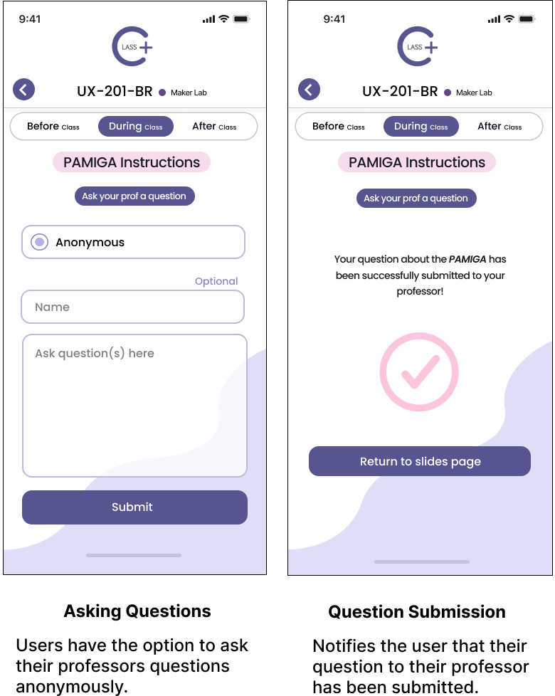
2) “I want to send anonymous questions to the professor”.
Users want the option to ask questions to professors anonymously. This way, they can ask for clarification in a way that doesn’t bring attention to them.
3)”Why was this person chosen to be my study buddy?”
Users express they want transparency into why their study buddy was chosen for them.
4)”Will I still be able to chat with past study buddies?”
Users want a way to keep connected with past study buddies so they don’t lose friendships, and in turn resources.
5)”I would love to look at my past quizzes for notes”.
Users want to be able to view their previously written quizzes. This way they can refer back to their answers, add to their notes and continue practicing concepts.
Use the filter to organize a course’s previous, upcoming and last opened lecture summaries.
ITERATION ONE 🧠
Send anonymous questions to professors by selecting the ‘Anonymous’ option.
ITERATION TWO 🧠
View past study buddies and keep those connections! A description under a new study buddy’s name, also explains why they were chosen for a user during that week.
ITERATION THREE 🧠
View past quizzes taken while being able to view the correct answers, and the answers users gave.
ITERATION FOUR 🧠
HIGH-FIDELITY PROTOTYPE ⌛
Iterations Applied - Final Product
Through this design thinking journey I present to you the final mobile application, Class+:
1) Getting Started
2) BEFORE Class
3) DURING Class
4) AFTER Class
5) Study Buddy
Takeaways
KEY INSIGHTS 💜
01. Breaking Down Ideas
By breaking down our ideas with the design thinking process and receiving constant feedback, it helped us to uncover many different insights that we wouldn’t have noticed needed iterations applied. By uncovering those areas, it helped us develop a design solution closer and closer to achieving our user’s needs and wants; ultimately creating a better user experience for them as well!
02. Met User Needs = Good Experiences
Overall, as university students have suddenly been thrown into an online learning environment, they should have access to tools that can help smooth their transition. Our team believes the Class+ app meet our users needs with their concerns to better their experiences through its ability to:
Connect users with peers
Help users prepare for lectures and concepts beforehand
Allow them to anonymously let their professors know about their comfortability with class content
To quiz their knowledge with lecture concepts


